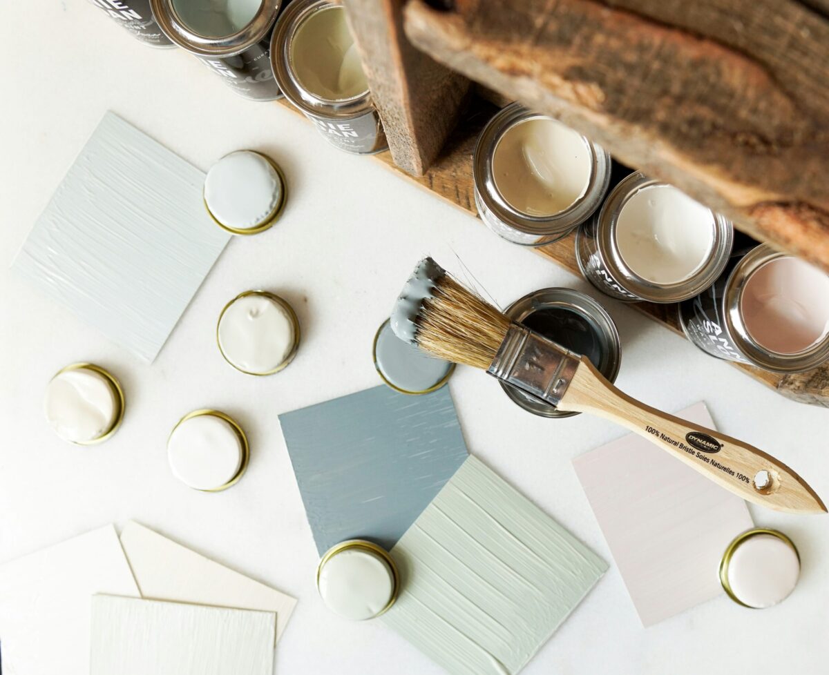
One of my favorite paints to use when designing for the season is Farrow & Ball. I absolutely love their timeless colors and the exceptional quality of their products. Their rich, sophisticated hues make it so easy to create spaces that feel both cozy and elegant—perfect for fall. This season, I’m excited to share some of my top Farrow & Ball color combinations that will help transform your home into a warm and inviting retreat, just in time for autumn.
Whether you’re looking to refresh your living room, bedroom, or even your entryway, these fall-inspired palettes will bring the beauty of the season indoors. Let’s dive into how these colors can work their magic in every room!
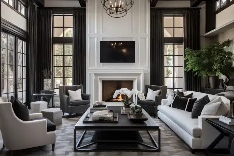
1. Living Room: Cozy Neutrals and Warm Accents
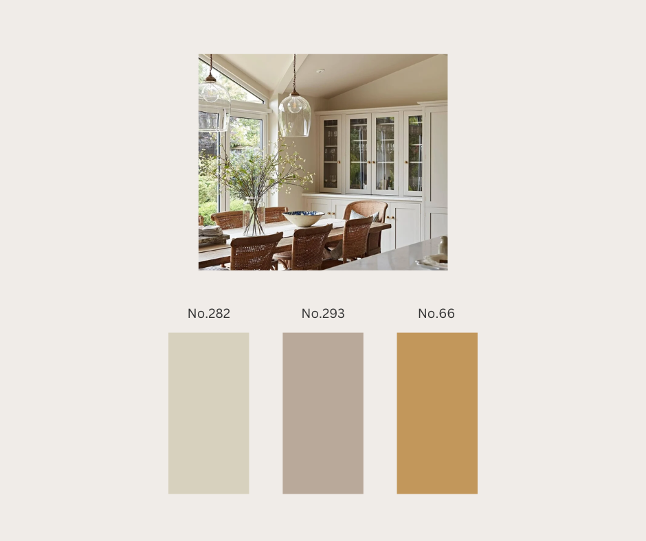
For the living room, I love starting with a neutral base and adding warmth through accents. Farrow & Ball’s Shadow White (No.282) is a timeless soft neutral that gives your living room a cozy, calm feel, especially when paired with Jitney (No.293), a sandy beige. Together, they create an understated backdrop that you can easily personalize with fall touches like throws and cushions.
To add a seasonal pop, try introducing India Yellow (No.66). This rich mustard hue mimics the vibrant autumn leaves, perfect for cushions, artwork, or a statement chair.
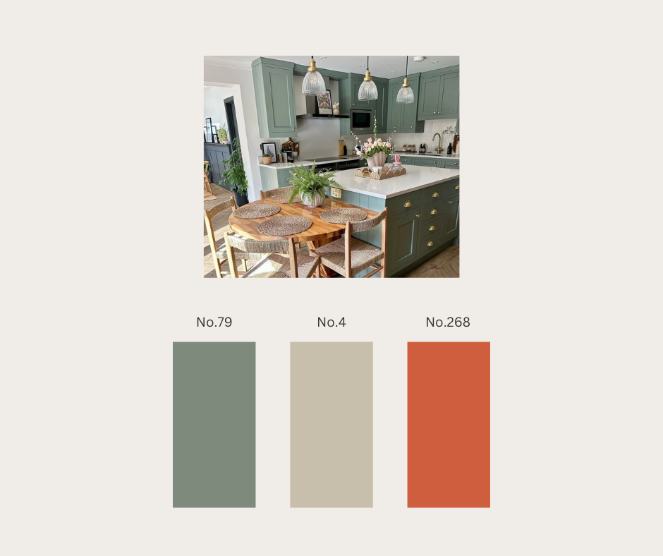
2. Kitchen: Earthy Hues with a Bold Twist
The kitchen is the heart of the home, and this fall, earthy tones will make it even more inviting. For cabinetry, consider Card Room Green (No.79). This classic, muted green brings an organic, timeless vibe to the kitchen and pairs beautifully with Old White (No.4) on the walls.
To give the room a bold autumn twist, add accessories in Charlotte’s Locks (No.268), a fiery orange that radiates energy. Whether it’s in small details like tea towels or a bold backsplash, this shade is perfect for fall.
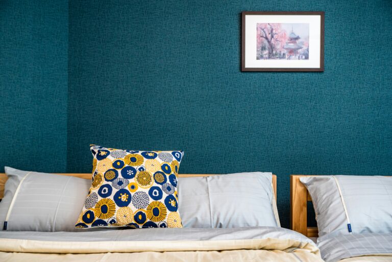
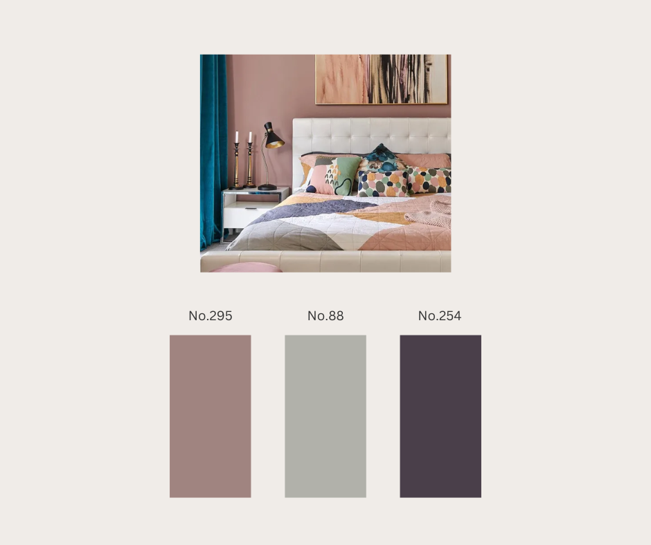
3. Bedroom: Soft and Warm Serenity
Your bedroom should be a serene retreat, and the soft warmth of Sulking Room Pink (No.295) is ideal for fall. This dusty pink brings a sense of quiet comfort, especially when paired with Lamp Room Gray (No.88) for trim or furniture. The subtle contrast between the two creates a peaceful, balanced space that feels luxurious yet relaxed.
To elevate your bedroom design for fall, consider adding hints of Pelt (No.254), a deep, regal purple, through bedding or blankets. This rich hue adds a touch of depth and sophistication, perfect for creating a cozy, inviting atmosphere.
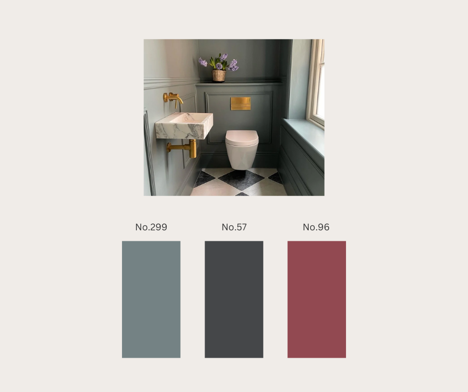
4. Bathroom: Crisp and Moody
For the bathroom, fall is the perfect time to embrace moodier tones. De Nimes (No.299) is a cool, chalky blue that evokes the tranquility of early fall evenings. It’s a timeless shade that works wonderfully on bathroom walls, especially when paired with Off-Black (No.57) for cabinetry or accents.
To warm up this moody palette, introduce Radicchio (No.96), a bold berry red. Whether in towels or a statement mirror, this color brings a striking contrast that enlivens the space while keeping it seasonally appropriate.
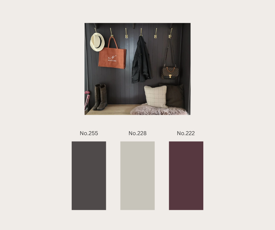
5. Entryway: Welcoming Warmth
Your entryway sets the tone for the rest of your home, and for fall, there’s no better way to make a statement than with Tanner’s Brown (No.255) on your front door. This deep, chocolatey hue is rich and inviting, creating an eye-catching entrance that feels instantly welcoming.
Pair this with Cornforth White (No.228) on your walls for a lighter, more neutral backdrop that keeps the space feeling open and bright. To add an autumnal pop of color, incorporate planters or decor pieces in Brinjal (No.222), a rich aubergine shade that complements the deeper tones.
This fall, embrace the season’s warmth and comfort by transforming your home with Farrow & Ball’s autumn-inspired palette. From cozy living rooms to moody bathrooms, these colors will bring the beauty of the changing season indoors, creating a space where you can relax, gather, and enjoy the crisp autumn air.
With love,
Your designer mind <3